import pandas as pd
import numpy as np
import matplotlib.pyplot as plt
import scipy.stats as stats
import seaborn

# See: Comment (1)
sb_dark = seaborn.dark_palette("skyblue", 8, reverse=True)
seaborn.set(palette=sb_dark)
- Comment 1: Nothing terribly exciting. We're bringing in all the standard libraries we need to analyze and visualize our data. The potentially unique thing here is "Seaborn", a wonderful library that painlessly transforms our heretofore pathetic graphs into things of overpowering beauty.
How painless is Seaborn? Prior to calling seaborn.set(palette = sb_dark), our histograms looked like this:

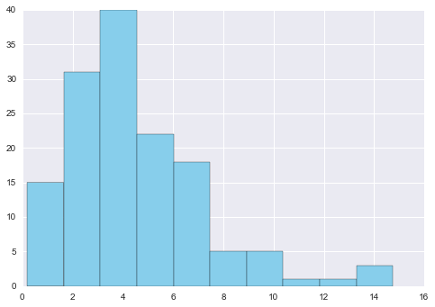
Wonderful.
In the example above, seaborn.dark_palette() creates a list -- or "palette" -- of eight colors, ranging from sky blue to very dark grey (hence the name "dark_palette"). Colors themselves are (r, g, b, alpha) tuples, so if we printed out our color palette, we'd simply see 32 numbers and 8 sets of parentheses.
Reading Data
Now that all our libraries are accounted for, we'll need data. I hear they have that on The Internet now, but for this example, let's assume we already have some. Relative to our current directory, we can find this data in a folder we've named "data", and in a file we've named "data.txt". Let's further assume that we've investigated our data via the command line, and so we know it's tab-separated.
nville = pd.read_csv("data/data.txt", sep="\t") # See: Comment (1)
- Here, we're going to the pandas library and invoking its read.csv() function on our file. This function returns an object of the DataFrame class.
DataFrame objects are amazing things. They hold the same information that our text file did, but they have methods, like this one:
nville.head()
| Year | Jan | Feb | Mar | Apr | May | Jun | Jul | Aug | Sep | Oct | Nov | Dec | |
|---|---|---|---|---|---|---|---|---|---|---|---|---|---|
| 0 | 1871 | 2.76 | 4.58 | 5.01 | 4.13 | 3.30 | 2.98 | 1.58 | 2.36 | 0.95 | 1.31 | 2.13 | 1.65 |
| 1 | 1872 | 2.32 | 2.11 | 3.14 | 5.91 | 3.09 | 5.17 | 6.10 | 1.65 | 4.50 | 1.58 | 2.25 | 2.38 |
| 2 | 1873 | 2.96 | 7.14 | 4.11 | 3.59 | 6.31 | 4.20 | 4.63 | 2.36 | 1.81 | 4.28 | 4.36 | 5.94 |
| 3 | 1874 | 5.22 | 9.23 | 5.36 | 11.84 | 1.49 | 2.87 | 2.65 | 3.52 | 3.12 | 2.63 | 6.12 | 4.19 |
| 4 | 1875 | 6.15 | 3.06 | 8.14 | 4.22 | 1.73 | 5.63 | 8.12 | 1.60 | 3.79 | 1.25 | 5.46 | 4.30 |
This allows us to quickly see what data we're dealing with. In this particular case, it's the average monthly precipitation in Nashville going all the way back to 1871. (Alright, so there's no way you could have known that without me telling you).
Great... So when are you actually going to do something?
Now -- I promise!
We're going to plot twelve histograms, each one visualizing the distribution of rainfall for a particular month. Then, we're going to try to model each month's distribution as a Gamma random variable, and plot the associated Gamma PDF over the associated histogram. Why use Gamma? Well, this guy wrote a long academic paper on it, and people who use font that small generally know what they're doing.
We're going to parameterize our Gamma distribution in two ways: Once using Method of Moments and once using Maximum Likelihood. For more on that particular topic, you can read this wiki written by -- shameless plug! -- my alma mater.
Fantastic. Now that you know the problem at hand, we can dive in. That's my code below. To spare you from as much of my writing as possible, I've included a number of comments that say, "See: Comment." That way, you'll only need to consult my writing when you're profoundly confused.
See: Despite my impossibly long-winded introduction, I really do care about your time.

And with that, I leave you with the fruit of our statistical computing

Great... So when are you actually going to do something?
Now -- I promise!
We're going to plot twelve histograms, each one visualizing the distribution of rainfall for a particular month. Then, we're going to try to model each month's distribution as a Gamma random variable, and plot the associated Gamma PDF over the associated histogram. Why use Gamma? Well, this guy wrote a long academic paper on it, and people who use font that small generally know what they're doing.
We're going to parameterize our Gamma distribution in two ways: Once using Method of Moments and once using Maximum Likelihood. For more on that particular topic, you can read this wiki written by -- shameless plug! -- my alma mater.
Fantastic. Now that you know the problem at hand, we can dive in. That's my code below. To spare you from as much of my writing as possible, I've included a number of comments that say, "See: Comment." That way, you'll only need to consult my writing when you're profoundly confused.
See: Despite my impossibly long-winded introduction, I really do care about your time.
# We are going to plot 12 histograms, one for every month

months = ["January", "February", "March", "April", "May", "June",
          "July", "August", "September", "October", "November", "December"]
num_rows, num_columns = 4, 3


fig, our_axes = plt.subplots(nrows=4, ncols=3, figsize=(15, 15)) # See: Comment (1)
monthly_axes = [ax for ax_row in our_axes for ax in ax_row]

for i, month in enumerate(months):
    current_ax = monthly_axes[i]

    current_month_data = nville[month[:3]]  # Store relevant column in current_month_data
    current_ax.hist(current_month_data) # Ask Axes object to plot a histogram
    current_ax.set_title(month)         # Give our Axes a unique title
    current_ax.set_ylabel("Counts")
    current_ax.grid(False)              # Turn off gridlines -- they're ugly


    # Now, we're going to fit our Gamma Distribution
    # As mentioned, we're going to find the parameters in two ways:
    # (1) "Manually", using Method of Moments
    # (2) "Automatically", using MLE by way of SciPy objects/methods

    # The Manual Way (primarily to demonstrate numpy)
    current_mean = np.mean(current_month_data)
    current_var = np.var(current_month_data)
    moment_alpha = (current_mean*current_mean)/(current_var)
    moment_beta =  current_mean/(current_var)
    moment_gamma = [moment_alpha, 0, moment_beta]
    gamma1 = stats.gamma(*moment_gamma) # See: Comment (2)

    # The Easy Way (MLE)
    mle_gamma = stats.gamma.fit(current_month_data) # See: Comment (3)
    gamma2 = stats.gamma(*mle_gamma)


    # Plotting the PDFs of our Gamma Distributions
    x_min = np.min(current_month_data)
    x_max = np.max(current_month_data)
    x = np.linspace(x_min, x_max)

    current_ax_twin = current_ax.twinx() # See: Comment (4)
    current_ax_twin.grid(False)

    # See: Comment (5)
    gamma1_lab = r'$\gamma(\alpha=%.2f, \beta=%.2f$' % (moment_alpha, moment_beta) + ')'
    gamma2_lab = r'$\gamma(\alpha=%.2f, \beta=%.2f$' % (mle_gamma[0], mle_gamma[2]) + ')'

    current_ax_twin.plot(x, gamma1.pdf(x), color=sb_dark[3], label=gamma1_lab)
    current_ax_twin.plot(x, gamma2.pdf(x), color=sb_dark[7], label=gamma2_lab)
    current_ax_twin.legend()

fig.tight_layout() # See: Comment (6)
plt.show()         # Fin!
- Comment 1: In this line, we're invoking matplotlib.pyplot's subplots function, and informing it that we would like to create a Figure and twelve Axes. The axes themselves are arranged on a four-by-three grid. Importantly, we could have left out this code (we would have needed to modify our subsequent for loop, but it wouldn't have been as painful as you might imagine). But how? Isn't instantiating a Figure and some Axes an important step in displaying some axes on a figure? Yes! But matplotlib has some sensible default behavior:
- Automatically creating a one-by-one subplot (i.e., a single Axes object)
- Making this subplot the "go-to" axes, such that any time you call the plot function in the pyplot namespace, it's as though you called it directly on the axes itself (technically, pyplot calls the "get current axis" method to know what to do, but the end result is the same)
- While I appreciate how friendly matplotlib tries to be, when coding, I prefer to be as explicit as possible: Hence the subplots.
- Comment 2: There's a lot going on here. We begin by using numpy's aplty-named mean and var functions to find the mean and variance of our current month's data. Next, we calculate the two parameters of our Gamma distributions in terms of our data's mean and variance. Finally, we pass our painstakingly crafted alpha and beta arguments to SciPy's stats.gamma function. This creates our Gamma.
- Comment 3: Unfortunately for the six lines of code I just discussed, we can not only find a much better-fitting Gamma distribution given our data, but we can do so in only one line of code using SciPy's fit functions (norm.fit, gamma.fit, expon.fit, etc.). Broadly speaking, these work by maximizing the likelihood that we would have observed our data given a particular distribution, and they do so by tweaking the parameters of a distribution until they're confident they can't do any better.
- Comment 4: Since we are trying to visually communicate the notion of a random variable's "fit," it would be helpful to overlay the associated PDF over the associated histogram. But think about this for a moment: Histograms count the number of observations that fall within certain bins, and since our data has many dozens of rows, these counts are going to be as high as thirty or forty.
- Conversely, PDF's are miniscule. Plotting them on the same scale (i.e., the same y-axis) would be silly; however, this is matplotlib's default behavior.
- We need to explicitly say that we want to use a different scale, and we do so by specifying which axis our plots are going to share: In our particular case, our x-axis is going to refer to inches of rainfall regardless of whether we're referring to histograms or PDF's, so we can call the twinx method on our current axes object. Technically, this returns a brand new instance of the class Axes -- one that just so happens to share a position with the axes that brought it into the world.
- Comment 5: I promised we would address LaTeX labeling, and I already regeret it. But here we are anyway. Luckily, matplotlib takes the majority of the pain out of it. By enclosing the inside of a string inside "$" symbols, we can quickly turn our strings into thesis-ready LaTeX.
- For example, when you're talking to matplotlib, "potato" is the string potato, and "$potato$" is the LaTeX version:
potato_fig, potato_ax = plt.subplots(1, 1)
plt.figtext(.2, .7, "potato\n\n$potato$", axes=potato_ax, fontsize="xx-large")
- There's one minor complication: To specify characters like "alpha" and "beta", we need to use special strings like '$\alpha$' and '$\beta$'. But in Python, the backslash already has a special meaning -- it's the escape character -- meaning that before matplotlib ever had a chance to make a fancy LaTeX label, Python would have already looked at the string and removed any backslashes that weren't themselves preceded by a backslash.
- This is where the "r" in front of each string comes from: It makes our strings raw, which is a programmer way of saying, "Hey, Python, you know all those things you normally do with my strings? Don't."
- That way, matplotlib gets the string exactly as we wrote it -- backslashes and all -- and can parse those strings according to its own standards, not Python's.
- Comment 6: Think of our individual Axes objects as kindergartners. They are all perfectly unique snowflakes -- at least according to their parents -- with their own names, their own desks, and their own Gamma distributions.
- However, kindergartners need structure. If we left them unattended, elementary school classrooms would quickly descend into chaos. You can imagine children running into each other, a great deal of yelling and crying, finger paint on the walls... You know, your typical Investment Bank.
- You can see where I'm going: What we need is a teacher, the Figure object. It's a container which manages the position and behavior of the Axes within. The Figure object has a special method called tight_layout, which, in the spirit of completely running our analogies into the ground, is the matplotlib equivalent of a teacher turning the lights on and off and slowly counting to three: Everyone returns to their desk (or in our case, axes' labels and tick marks don't overlap).
- This ensures that our plots don't degenerate into a Lord of the Flies-style dystopia or crash the global economy.
And with that, I leave you with the fruit of our statistical computing
